
Wikipedia:Featured picture candidates/March-2005
| Featured picture tools |
|---|
Please cut and paste new entries to the bottom of this page, creating a new monthly archive (by closing date) when necessary.
Weedy Seadragon[edit]

The Weedy sea dragon taken by Richard Ling.
Its a striking image of an animal in its natural habitat. It's pin sharp and well lit. — Zeimusu | Talk
- Nominate and support. — Zeimusu | Talk 14:08, 18 Feb 2005 (UTC)
- Now this is cool! Support Denni☯ 22:45, 2005 Feb 18 (UTC)
- Absolutely support. Striking. Mgm|(talk) 23:43, Feb 18, 2005 (UTC)
- Support. James F. (talk) 23:44, 18 Feb 2005 (UTC)
- Wow! Just wow!. Quadruple-support! Neutralitytalk 05:56, Feb 19, 2005 (UTC)
- Support -- Longhair 20:32, 19 Feb 2005 (UTC)
- Support. Magnificent Shot! --Fir0002 10:57, 23 Feb 2005 (UTC)
- Only just released I forgot to sign the above comment :) --Fir0002 10:57, 23 Feb 2005 (UTC)
- Support, though my first impression looking at the hi-res was, "Looks like a composite." —Korath (Talk) 10:12, Feb 20, 2005 (UTC)
- Full Support -- Chris 73 Talk 11:50, Feb 20, 2005 (UTC)
- Support. A little too blurry by the tail, but since its an underwater shot, I'll let it pass. →mathx314(talk)(email) 20:29, 21 Feb 2005 (UTC)
- Support. Great shot. - Jpo 03:31, Feb 24, 2005 (UTC)
- Support -- Elijah 21:58, 2005 Feb 24 (UTC)
- Support Niiiiiice Junes 17:55, 25 Feb 2005 (UTC)
- Support --brian0918™ 13:30, 28 Feb 2005 (UTC)
- Wowwwwww... Suport Tygar 04:28, Mar 2, 2005 (UTC)
- Support. Alphax τεχ 02:04, Mar 3, 2005 (UTC)
- Support. -- AllyUnion (talk) 03:01, 3 Mar 2005 (UTC)
Habanero[edit]

A habanero, the spiciest food in the world. Taken by Aka. Beautiful, striking color and contrast. Illustrates the subject perfectly, with no extraneous information, and captures the eye. Neutralitytalk 05:55, Feb 19, 2005 (UTC)
- Support. Neutralitytalk 05:55, Feb 19, 2005 (UTC)
- Support -- Longhair 20:27, 19 Feb 2005 (UTC)
- Support - Nice; colors are great. It looks deceptively delicious!--Deglr6328 05:22, 20 Feb 2005 (UTC)
- Oppose; the pink area at the bottom is distracting. —Korath (Talk) 10:15, Feb 20, 2005 (UTC)
- Support -- Chris 73 Talk 11:50, Feb 20, 2005 (UTC)
- Support. I like spicy foods and this definitely looks tasty. 131.211.210.32 13:40, 21 Feb 2005 (UTC)
- Weak Oppose. Although I like this image alot, I dont like the stalk which appears to have started to rot. Unless this is how they are picked off the bush then I couldn't support. --Fir0002 11:13, 23 Feb 2005 (UTC)
- Support. Impressive shot. - Jpo 03:33, Feb 24, 2005 (UTC)
- Support. Nice colors Junes 17:57, 25 Feb 2005 (UTC)
- Oppose. Doesn't strike me as fascinating. The white background makes it look unnatural. Enochlau 23:32, 25 Feb 2005 (UTC)
Apricot[edit]

A very nice photo of apricots.
- Support. Self Nom. --Fir0002 06:38, 15 Feb 2005 (UTC)
- Support. Saw it be uploaded in LRCF, thought of FP immediately. Frencheigh 06:40, 15 Feb 2005 (UTC)
- Support. Makes me hungry -- Chris 73 Talk 06:48, Feb 15, 2005 (UTC)
- Yep, nice composition and color. Also in focus. Support. Mgm|(talk) 08:39, Feb 15, 2005 (UTC)
- Support Excellent picture - Adrian Pingstone 14:23, 15 Feb 2005 (UTC)
- Support. Yum. —Korath (Talk) 16:28, Feb 15, 2005 (UTC)
- Support. Great color, sharpness and bokeh. Alight 22:40, 15 Feb 2005 (UTC)
- Support. They look good enough to eat! --Chris 23:14, Feb 16, 2005 (UTC)
- Support. James F. (talk) 23:44, 18 Feb 2005 (UTC)
- Support. Neutralitytalk 05:57, Feb 19, 2005 (UTC)
- Support -- Longhair 20:29, 19 Feb 2005 (UTC)
- Support --brian0918™ 13:34, 28 Feb 2005 (UTC)
- Weak support. Off-center, but the full-size is so darn sharp and tasty-looking, I just had to vote yes. grendel|khan 04:11, 2005 Mar 2 (UTC)
- Support. I have a new wallpaper. :) TheCoffee 16:03, 2 Mar 2005 (UTC)
- Support. -- AllyUnion (talk) 03:01, 3 Mar 2005 (UTC)
Tomato[edit]

A beautiful red tomato I grew myself.
- Support. Self Nom. --Fir0002 11:12, 23 Feb 2005 (UTC)
- Oppose: It's a nice tomato, but I don't feel I've learnt anything new from this picture. — Zeimusu | Talk 15:08, 23 Feb 2005 (UTC)
- Oppose. Um, it's just a nice-looking tomato. Distracting background, odd perspective on the hand. - Jpo 03:36, Feb 24, 2005 (UTC)
- Oppose - The hand looks out of place. I'd have preferred to see this tomato unpicked and photographed in its' natural state. -- Longhair 08:23, 24 Feb 2005 (UTC)
- Oppose - I don't see how a hand holding a tomato could be a Featured Pic (but the pic quality is great) - Adrian Pingstone 10:33, 25 Feb 2005 (UTC)
- Oppose solely due to shadows on the hand. I don't consider the background, perspective, or presence of the hand distracting; as a whole, the picture works better than, say, a tomato on a sterile, antiseptic, white background. —Korath (Talk) 04:29, Feb 28, 2005 (UTC)
Geitoneura klugii[edit]

A good shot of geitoneura klugii on a branch.
- Support. Self Nom. --Fir0002 09:27, 20 Feb 2005 (UTC)
- Support. Easily passes my desktop wallpaper test. —Korath (Talk) 10:18, Feb 20, 2005 (UTC)
- Support -- Chris 73 Talk 11:48, Feb 20, 2005 (UTC)
- Support -- Longhair 12:53, 20 Feb 2005 (UTC)
- Support. Looks sharp. Mgm|(talk) 13:43, Feb 21, 2005
- Oppose - Focus is good but colors are a bit drab and both [1] [2] previous featured pictures of lepidopterae are better I think.--Deglr6328 07:32, 23 Feb 2005 (UTC)
- Support Dsmdgold 17:58, Feb 25, 2005 (UTC)
- Support. Excellent clarity. Enochlau 23:31, 25 Feb 2005 (UTC)
- Oppose, see old FP pics and compare. BrokenSegue 03:32, 2 Mar 2005 (UTC)
- Oppose - dark background makes it hard to see detail, especially around mouth - Bevo 12:39, 5 Mar 2005 (UTC)
- Oppose. Very nice, but the dark branch breaks the outline of the butterfly. And the head is not completely in focus. Janderk 11:42, 8 Mar 2005 (UTC)
![[1]](https://en.wikipedia.org/wiki/Image:Meadow_Argus02.jpg)
![[2]](https://en.wikipedia.org/wiki/Image:Emperor_Gum_Moth.jpg)
Northwestern arch[edit]

Self-nom. — Dan | Talk 02:10, 28 Feb 2005 (UTC)
- Oppose. Off-center (and I don't think a crop would help); bricks on the left are overexposed; needs perspective correction. —Korath (Talk) 04:22, Feb 28, 2005 (UTC)
- Oppose I don't think a University gateway could be a featured pic unless the pic was really exceptional. This one is just ordinary - Adrian Pingstone
Bison skull pile[edit]

I recently saw this photo on a documentary and immediately thought of W:FPC. It is an enormous pile of bison skulls waiting to be ground for fertilizer, in the 1870s. The way the photo was presented in the documentary involved a slow zoom-out from the man at the top to reveal the entire pile-- it definitely fits the criteria of striking/shocking/impressive. The photo demonstrates the extensive slaughter of the bison: from around 60 million in 1800 to as few as 750 in 1890.
Unfortunately, the largest version of this photo on the internet is not very large, and it doesn't appear to be available in any books for scanning. So, I will present the best that I could find, cleaned up as much as possible. It is currently featured in the article American bison, which appears to be the only article that talks about the slaughter of the bison. --brian0918™ 05:26, 28 Feb 2005 (UTC)
- Nominate and support. --brian0918™ 05:26, 28 Feb 2005 (UTC)
- Support for impact. Dear god, what have we done? – ClockworkSoul 05:28, 28 Feb 2005 (UTC)
- I've attempted to clean it up further, others are welcome to do the same. --brian0918™ 05:40, 28 Feb 2005 (UTC)
- Support. -- Chris 73 Talk 07:08, Feb 28, 2005 (UTC)
- Support, great example of a striking, shocking image. Mgm|(talk) 10:28, Feb 28, 2005 (UTC)
- Support, fits the criteria for Featured Pic perfectly - Adrian Pingstone 10:35, 28 Feb 2005 (UTC)
- Support Junes 13:47, 28 Feb 2005 (UTC)
- Support. It's very easy to click through articles on endangered species and shrug, but this stops you in your tracks. And good job on the touchup. —Korath (Talk) 12:12, Mar 1, 2005 (UTC)
- Support. -- AllyUnion (talk) 03:01, 3 Mar 2005 (UTC)
- Support. I seem to recall that Pol Pot built similar mounds of skulls in Cambodia, although he didn't use bison. -- Solipsist 22:46, 5 Mar 2005 (UTC)
- Support. Very odd picture, but I like it. →mathx314(talk)(email) 20:07, 6 Mar 2005 (UTC)
- Support. Very striking! Kitanzi 22:51, 10 Mar 2005 (UTC)
- Support- gives a person a good feel for the full extent of the slaughter; it really drives the point home. TomStar81 06:12, 11 Mar 2005 (UTC)
- Whoa. Definitely support. - Vague | Rant 13:27, Mar 13, 2005 (UTC)
Oxford Canal[edit]

Self nom - I took this a few days ago with my fancy new camera, and I'm rather proud of it, what does everyone else think. G-Man 21:09, 1 Mar 2005 (UTC)
- Nominate and support. G-Man 21:09, 1 Mar 2005 (UTC)
- Oppose. Rendered utterly impotent by the fields and the sky. Denni☯ 00:13, 2005 Mar 2 (UTC)
- Oppose. A pretty enough picture, but
the sky and its reflection are overexposed, andthe grass in the foreground seems a tad oversaturated. The biggest problem, as Denni points out, is that this poorly illustrates the canal itself; your Image:Oxford Canal at Hillmorton.jpg does this better. —Korath (Talk) 03:47, Mar 2, 2005 (UTC) - Oppose -- This picture just seems too busy picturing everything else but the canal itself. -- Longhair | Talk 14:49, 2 Mar 2005 (UTC)
- Support. This sets this canal in its context. This was an industrial highway in its heyday and is now a pastoral by-water in the rich agricultural fields of Warwickshire. As to the sky - this is February in England; that's not overexposure, that what the sky is like. Although I prefer my images less bold and I would probably have avoided enhancing it, neverthless I would be proud of the image Velela 15:02, 2 Mar 2005 (UTC)
- Comment Velela is right, the purpose of the photograph was really to show the canal within the setting of the landscape. So I surpose it's really a landscape picture, with the canal as its main feature rather than strictly a canal photograph. Perhaps I should have said that to begin with. Apart from that most of the other criticisms seem quite minor. G-Man 22:24, 3 Mar 2005 (UTC)
- Support. If you look at the thumbnail, it does seem too little canal and too much field, but the full image itself is excellent, I think, in giving a good image of the canal in its "natural habitat". A closer image of the canal itself would be much less striking and brilliant, I think -- mostly just a higher-res image of water. If there's a way of taking a featurable picture of a canal, I think this has to be it. Jwrosenzweig 00:23, 5 Mar 2005 (UTC)
- Support. James F. (talk) 12:04, 8 Mar 2005 (UTC)
- Oppose. I agree with Longhair that the picture simply wants to do too much. Also, while the subject might be notewothy, you'd have to know exactly what it is to appreciate it. There are dozens of scenes like this in England I'd suspect (there are where I'm living). If the purpose is to show the landscape, well I think there can be prettier pictures for that.Junes 14:13, 12 Mar 2005 (UTC)
- Comment. Doesn't it explain what it is on the caption? G-Man 18:27, 13 Mar 2005 (UTC)
- Yes, it does, but what I mean is that I think Featured pictures should be able to stand on their own esthetically (except maybe diagrams). This is a really good picture, but in my opinion it's not as stunning as other Featured (landscape) pictures. Sorry. Junes 09:19, 14 Mar 2005 (UTC)
- Comment. Doesn't it explain what it is on the caption? G-Man 18:27, 13 Mar 2005 (UTC)
- Support. I just came across this on the Warwickshire page and was impressed. This is quite a famous scene, I have seen other versions of this image on calenders and postcards, and this is at least as good as the profesional versions. IMO the canal is sufficiently prominent in the image to stand out as the main feature. Gem 20:15, 12 Mar 2005 (UTC)
Alt route 1948[edit]
From Ridge Route and US 99. The verdant, rolling hills of 1948 California. Found by User:Lucky 6.9.
- Nominate and support. - grendel|khan 04:08, 2005 Mar 2 (UTC)
- Conditional Support - Full support if more info is added to the image description page, possibly with a link to the source. -- Chris 73 Talk 04:25, Mar 2, 2005 (UTC)
- Support. I'm not quite sure why, but I love this picture. Junes 01:10, 3 Mar 2005 (UTC)
- Support, though I'd also like more information per Chris 73. —Korath (Talk) 04:58, Mar 3, 2005 (UTC)
- Update. Now sourced with copyright information; it's from the California DOT's website. See image page for details. grendel|khan 03:01, 2005 Mar 4 (UTC)
- Oppose Not interesting.--Deglr6328 05:22, 4 Mar 2005 (UTC)
- Oppose Contrast isn't as good as it could be, some areas look washed out. -Lommer | talk 01:37, 6 Mar 2005 (UTC)
- Oppose. Janderk 11:53, 8 Mar 2005 (UTC)
- Support -- I like it. - Longhair | Talk 03:10, 10 Mar 2005 (UTC)
- Oppose --Fir0002 04:16, 11 Mar 2005 (UTC)
- Oppose - Bevo 15:22, 14 Mar 2005 (UTC)
Toronto Skyline Through Island[edit]


Photograph I took, I think that it is a nicely composed picture juxtaposing the city against nature. - Pdefer | !! 03:19, 2005 Mar 2 (UTC)
- Self-Nom and support - Pdefer | !! 03:19, 2005 Mar 2 (UTC)
- Neutral. Would benefit from some smoothing in the sky, and perhaps a crop. —Korath (Talk) 03:34, Mar 2, 2005 (UTC)
- Support. Good shot -- Chris 73 Talk 04:24, Mar 2, 2005 (UTC)
- Comment: added alternative version. Fredrik | talk 15:55, 2 Mar 2005 (UTC)
- Oppose - the cropped version is definitely a better composition, I feel, but it looks to me like a scan from a print, at rather low resolution. The sky is very mottled (perhaps the JPEG is too compressed?), and sharpness is generally lacking. Worldtraveller 16:01, 2 Mar 2005 (UTC)
- Oppose. A nice snapshot, but not particularly outstanding. Denni☯ 03:23, 2005 Mar 3 (UTC)
- Oppose. Fully agree with Worldtraveller. --Fir0002 06:05, 3 Mar 2005 (UTC)
- Oppose Not particularly striking. Grainy buildings and sky are highly distracting.--Deglr6328 05:17, 4 Mar 2005 (UTC)
Delicate Arch[edit]

Geology doesn't get much more attractive. Illustrates Delicate Arch, but curiously not Arches National Park. - Solipsist 20:03, 2 Mar 2005 (UTC)
- Nominate and support. - Solipsist 20:03, 2 Mar 2005 (UTC)
- Support. Nice colors Junes 01:09, 3 Mar 2005 (UTC)
- Support. -- AllyUnion (talk) 03:01, 3 Mar 2005 (UTC)
- Support. -- BRIAN0918 03:13, 3 Mar 2005 (UTC)
- Support -- Chris 73 Talk 03:44, Mar 3, 2005 (UTC)
- Support. —Korath (Talk) 04:50, Mar 3, 2005 (UTC)
- Support Magnificent photo of a great formation. Exceptional. --Fir0002 06:13, 3 Mar 2005 (UTC)
- Support Incredibly beautiful. This is as close to perfect as I've seen here. Very strong support.--Deglr6328 05:08, 4 Mar 2005 (UTC)
- Support. —Sandover 07:04, 7 Mar 2005 (UTC)
- Support -- Longhair | Talk 18:58, 7 Mar 2005 (UTC)
- Support. James F. (talk) 12:05, 8 Mar 2005 (UTC)
- Support TomStar81 06:14, 11 Mar 2005 (UTC)
- Support. It illustrates it now! →mathx314(talk)(email) 20:42, 12 Mar 2005 (UTC)
- Support. --DanielNuyu 05:15, 14 Mar 2005 (UTC)
- Support --Thomas G Graf 15:25, 15 Mar 2005 (UTC)
Image moved to File:Delicatearch1.jpg. MER-C 07:44, 10 March 2009 (UTC)
Zuni girl[edit]
| Old version: |
 |
| New version: |
 |
Currently featured at Zuni and definitely adds significantly: in one image you have their art, clothing, culture, etc. I'd also say it fits the criteria of beautiful, striking, and/or impressive. - BRIAN0918 14:54, 2 Mar 2005 (UTC)
- Nominate and support. - BRIAN0918 14:54, 2 Mar 2005 (UTC)
- Support -- Chris 73 Talk 15:16, Mar 2, 2005 (UTC)
Oppose. Badly overexposed basket.Support Denni☯ 03:16, 2005 Mar 3 (UTC)Oppose, also due to the overexposure. Easily a featured picture otherwise. —Korath (Talk) 04:51, Mar 3, 2005 (UTC)- Ok, I've attempted to fix the overexposure using some photoshop tutorials. This is probably as good as it's gonna get without hiring an expert. :) BRIAN0918 07:08, 3 Mar 2005 (UTC)
- I'm not a great fan of improving photos by a master of photography (Edward S. Curtis). However it's a small png, a strange format for photos, I would suggest to go to the source to download the large TIFF and to convert it to a reduced JPG. Ericd 23:11, 4 Mar 2005 (UTC)
- Support the new version. — Dan | Talk 04:46, 8 Mar 2005 (UTC)
- Support edited version. Janderk 11:46, 8 Mar 2005 (UTC)
Child laborer[edit]

I found this one while looking through the Library of Congress collection -- a child laborer carrying 2 pecks of berries (probably about 30lbs). I think it at least fits the criteria of striking or shocking. Currently featured at Child labor. - BRIAN0918 04:42, 2 Mar 2005 (UTC)
- Nominate and support. - BRIAN0918 04:42, 2 Mar 2005 (UTC)
- Support with strong misgivings; the text for the image says that the child was attending school and merely worked during the summer. While this is obviously labour, it isn't entirely clear whether it is a good example of the sort of child labor refered to in the article - of the sweat shops we now associate with child labour or the sort of child labour which would naturally exclude all possibility of a proper education. -- Oarih 07:09, 2 Mar 2005 (UTC)
- I interpreted the wording to mean that school started 4 weeks ago, but that she hadn't been able to attend yet, and wouldn't be able to for 2 more weeks; she lives in Philadelphia while her job is in New Jersey. I can look for a more appropriate image if necessary. -- BRIAN0918 13:25, 2 Mar 2005 (UTC)
- Woops, yeah, you're right - the photo was taken September 28th, so she was obviously missing school. I still think it's a bit weak, though, since missing even six weeks of school isn't quite up there with being held out of it entirely as I'm sure some kids are -- Oarih 15:06, 2 Mar 2005 (UTC)
- I interpreted the wording to mean that school started 4 weeks ago, but that she hadn't been able to attend yet, and wouldn't be able to for 2 more weeks; she lives in Philadelphia while her job is in New Jersey. I can look for a more appropriate image if necessary. -- BRIAN0918 13:25, 2 Mar 2005 (UTC)
- Support -- Chris 73 Talk 15:16, Mar 2, 2005 (UTC)
- Support. —Korath (Talk) 04:52, Mar 3, 2005 (UTC)
- Support I think it's the facial expression of the kid that gives the impression of child labour the most. --Fir0002 06:10, 3 Mar 2005 (UTC)
- Support. Janderk 11:47, 8 Mar 2005 (UTC)
- Support. James F. (talk) 12:06, 8 Mar 2005 (UTC)
Walt Whitman[edit]
 |
 |
 |
Just browsing through the poetry article when I was struck by this picture of Walt Whitman. I love the contrast and shadows and the detail on the beard. This is my first time to nominate a picture. TheCoffee 09:20, 1 Mar 2005 (UTC)
- Nominate and support. TheCoffee 09:20, 1 Mar 2005 (UTC)
- Support. Nice beard. -- Chris 73 Talk 09:31, Mar 1, 2005 (UTC)
- Weak oppose; jpeg artifacts. —Korath (Talk) 12:05, Mar 1, 2005 (UTC) (Support second or third versions. —Korath (Talk) 11:09, Mar 6, 2005 (UTC))
- Support. Denni☯ 00:24, 2005 Mar 2 (UTC)
- Support original photo. I like the kind of moody off white a lot more than the every day black and white of the adjusted one. I also think the unadjusted one looks sharper in the beard --Fir0002 06:11, 3 Mar 2005 (UTC)
- I agree. TheCoffee 06:58, 4 Mar 2005 (UTC)
- I've uploaded a third version, in a attempt to satisfy everybody. It's also full-size, which is probably overkill. —Korath (Talk) 10:06, Mar 4, 2005 (UTC)
- Support. The third version looks very good, the first also.✏ Sverdrup 15:25, 4 Mar 2005 (UTC)
- Support the third version, Oppose the second. -Lommer | talk 01:42, 6 Mar 2005 (UTC)
- Support the third version, don't mind the first. (The second appears artificial.) Sandover 05:10, 7 Mar 2005 (UTC)
- Support. Janderk 11:42, 8 Mar 2005 (UTC)
- Support 2nd photo. To me, it looks better than the other two. TomStar81 00:42, 13 Mar 2005 (UTC)
Bang Pa-In floating pavilion[edit]
 |
 |
Interesting and striking colors. Used Bang Pa-In, photo is from the Commons, taken by Rdsmith4 - AllyUnion (talk) 03:22, 3 Mar 2005 (UTC)
- Nominate and support. - AllyUnion (talk) 03:22, 3 Mar 2005 (UTC)
- Support -- Chris 73 Talk 03:45, Mar 3, 2005 (UTC)
Oppose due to jpeg artifacts in the sky. —Korath (Talk) 04:49, Mar 3, 2005 (UTC)- I'm not certain what you are referring to. Could you upload a favorable version without said artifacts? -- AllyUnion (talk) 20:01, 3 Mar 2005 (UTC)
- I don't know why the file was compressed. Fortunately, I still had the original on CD, which I have uploaded. — Dan | Talk 20:51, 6 Mar 2005 (UTC)
- Support. However, it's worth noting that while it's an excellent picture of a Thai-style pavilion (and has in fact been designated as an Official National Symbol, see [3]), it's quite uncharacteristic of the other buildings at Bang Pa-In, which are all European or Chinese in style. Jpatokal 15:25, 5 Mar 2005 (UTC)
- Support #2 - Bevo 16:18, 20 Mar 2005 (UTC)
- Support - Solipsist 13:27, 21 Mar 2005 (UTC)
Dry Tortugas[edit]

Currently featured at Dry Tortugas. There are a lot of other striking photos of this island group / fort, but they're all under copyright. - BRIAN0918 05:35, 3 Mar 2005 (UTC)
- Nominate and support. - BRIAN0918 05:35, 3 Mar 2005 (UTC)
- Strong support. All I can say is, wow. /sɪzlæk˺/ 05:39, 3 Mar 2005 (UTC)
- Support - Outstanding -- Chris 73 Talk 05:49, Mar 3, 2005 (UTC)
Oppose unless the photo was taken from a spy satellite. The full image isn't at all sharp. --Fir0002 06:13, 3 Mar 2005 (UTC)- Change to Support. The full res photo now looks quite acceptable, and the smaller one looks great. --Fir0002 07:52, 3 Mar 2005 (UTC)
- I've attempted to sharpen it some. Click on the history to see the two versions. It's certainly about as sharp as other featured pictures, such as: Image:Kiritimati-EO.JPG, Image:Lugano prokudin.jpg, or Image:Himalayas.jpg -- BRIAN0918 07:26, 3 Mar 2005 (UTC)
- Support - I visited in May 2004. This is a great view of it. Autiger 22:56, 4 Mar 2005 (UTC)
- Support. Beautiful. — Dan | Talk 04:43, 8 Mar 2005 (UTC)
- Support. James F. (talk) 12:05, 8 Mar 2005 (UTC)
- Support TomStar81 06:15, 11 Mar 2005 (UTC)
- Support --Spangineer ∞ 17:06, Mar 12, 2005 (UTC)
- Support. Neutralitytalk 04:13, Mar 18, 2005 (UTC)
Petrified wood closeup 2[edit]

I'd vaguely thought that petrified wood looked like normal wood, except, well, stonier. Thanks to Dschwen, now I know better. Both images currently featured in the article are quite good, but I feel this is the superior. —Korath (Talk) 07:00, Mar 3, 2005 (UTC)
- Nominate and support. —Korath (Talk) 07:00, Mar 3, 2005 (UTC)
- Support. That's about as close to actually being there as you can get. -- BRIAN0918 07:44, 3 Mar 2005 (UTC)
- Support. Really nice, especially the colors in the center of the "wood". Bratsche 00:00, Mar 4, 2005 (UTC)
- Support Very nice! Good focus, highly illustrative and just really interesting.--Deglr6328 05:34, 4 Mar 2005 (UTC)
- Support -- Chris 73 Talk 06:18, Mar 4, 2005 (UTC)
- Support -- Longhair | Talk 18:57, 7 Mar 2005 (UTC)
- Support. James F. (talk) 12:04, 8 Mar 2005 (UTC)
- Promoted: +7 / - 0 -- Solipsist 20:09, 22 Mar 2005 (UTC)
Australian Blue Dragonfly[edit]
 |
 |
Two great images (sorry Solipsist :-) ), of a Blue Dragonfly.
- Support. Self Nom. --Fir0002 07:55, 3 Mar 2005 (UTC)
- Support #1 Image:Aust blue dragonfly02.jpg -- Chris 73 Talk 11:35, Mar 3, 2005 (UTC)
- I'd support #1 Image:Aust blue dragonfly02.jpg if it appeared in an article. —Korath (Talk) 15:09, Mar 3, 2005 (UTC)
- Support when placed in a proper article. -- BRIAN0918 17:50, 3 Mar 2005 (UTC)
- Support if it meets the criterion of illustrating an article. Denni☯ 02:10, 2005 Mar 4 (UTC)
- Support I support the first one, the second one isn't quite as good. But I'm generally quite impressed. G-Man 22:24, 5 Mar 2005 (UTC)
- Support The first one is an awesome shot - agree with G-man. -Lommer | talk 01:20, 6 Mar 2005 (UTC)
- Support only the first one. The second shot could use some enhancing. JoJan 17:18, 8 Mar 2005 (UTC)
- Support #1 - Bevo 16:41, 20 Mar 2005 (UTC)
- Support either. Nice pictures. But is there a higher resolution version? --jacobolus (t) 23:45, 20 Mar 2005 (UTC)
- Promoted: +10 / - 0 -- Solipsist 20:23, 22 Mar 2005 (UTC)
Lake-effect snow[edit]
I was surprised that this wasn't already featured. I've become (nonvoluntarily) familiar with lake effect snow (my area usually gets hit the worst). Fits the criteria of striking/impressive/fascinating and adds qualitatively to the article Lake effect snow. - BRIAN0918 16:08, 4 Mar 2005 (UTC)
- Nominate and support. - BRIAN0918 16:08, 4 Mar 2005 (UTC)
- I'm ambivalent about this one. It's a dramatic image, but it's very difficult to interpret (and thus I feel it currently fails the "add significantly" test, IMHO). I can't quite tell what is cloud, what is snow, which direction the wind is blowing, and where the lake is and isn't. Maybe a really good caption would explain, but I think it really needs either a parallel diagram or a diagram and annotation overlaid on it. -- John Fader 17:00, 4 Mar 2005 (UTC)
- Any of the streaks are lake-effect snow clouds, dumping snow on the region underneath. As can be seen by the direction of the streaks, the wind is blowing southeastward, combining with a northeastward wind as the streaks extend to the east. I've added this information to the image's caption at Lake effect snow.
- I think it's one of the better examples of adding significantly. The image is not supposed to explain the entire article, but to aid as an example as one reads through the article. -- BRIAN0918 17:08, 4 Mar 2005 (UTC)
Oppose. The Lake Effect is an interesting one, but in this case, a diagram is far superior to a photo in explaining the phenomenon. I spend a lot of time with satellite images, but even so this one is difficult to interpret. I cannot see this is appropriate for FP status.On reconsideration, support Denni☯ 17:50, 2005 Mar 4 (UTC)- See Andrew's comments below. Another featured picture of the same sort is Image:Sunspot TRACE.jpg, which gives an excellent example of a sunspot and corresponding field lines, but doesn't have an informative overlay (eg direction of lines, highlighted lines, etc)
- Support. Gives a good picture of the phenomenon actually happening. A diagram would be nice in addition, but this picture clearly shows the snow and clouds appearing over the lake and being carried with it to be deposited downwind. I can't imagine a better photographic illustration of the idea. --Andrew 18:03, Mar 4, 2005 (UTC)
- Support. -Lommer | talk 01:15, 6 Mar 2005 (UTC)
- Support -- Chris 73 Talk 11:00, Mar 6, 2005 (UTC)
- Support TomStar81 06:16, 11 Mar 2005 (UTC)
- Support. Very dramatic view of the phenomenon! --Kitch 17:30, 18 Mar 2005 (UTC)
- Support. It shows exactly why they call it "lake effect". -- Riffsyphon1024 06:58, Mar 19, 2005 (UTC)
- Support at last. The photo has grown on me, and it is deserving. I've always wondered if better captioning might have cast its candidacy in a better light (I think the penny debate, by contrast, was begun rather well). Images are, in many cases, about the words we bring to them.
- I love reading about how the lake-effect moisture, in the form of snow, can drop two feet of snow in downwind New York and Pennsylvania in just a matter of hours. This information still doesn't quite completely satisfy me. I was born in Pittsburgh; is this, my home town, ever affected by "lake effect"? I want to know. This image is the beginning of a good discussion (in the form of an article). Sandover 01:25, 22 Mar 2005 (UTC)
- I'm pretty sure you won't get much or any lake-effect snow all the way out in Pittsburgh. The difference in snowfall near Lake Erie and not too far south of Lake Erie is pretty drastic. In Cleveland during the Great Lakes Storm of 1913, about 2 feet of snow were dropped, causing drifts of around 6 feet in height. My city and county of birth, in the northeast corner of Ohio, are one of the worst hit of them all, and it's not uncommon to see the (side) roads filled with feet of snow. I remember a particularly bad day where I had to shovel the driveway pretty much continuously because it just kept "blizzarding" all day. -- BRIAN0918 01:53, 22 Mar 2005 (UTC)
- Promoted. +9/-0-- Solipsist 20:47, 22 Mar 2005 (UTC)
Snowflake[edit]
I couldn't decide which of these to nominate, so I'll let you decide which is the best. I've put them in order of my preference, (1=most preferred), and others can as well. The winner will then be put in appropriate articles, such as at snowflake or snow. - BRIAN0918 04:12, 14 Mar 2005 (UTC)
- Nominate and support. Order of preference: 1, 2, 3. - BRIAN0918 04:12, 14 Mar 2005 (UTC)
- Support! Any of them! Slight preference to #1, but this would be unjust to the other ones. License is not perfect but acceptable, and I think we can add them to snowflake or snow anytime -- Chris 73 Talk 04:28, Mar 14, 2005 (UTC)
- Support all of them. I favor 1 the most. -- AllyUnion (talk) 06:04, 14 Mar 2005 (UTC)
- Support -Perfection. Favor #1.--Deglr6328 06:55, 14 Mar 2005 (UTC)
- Support all, favor 1. Junes 09:07, 14 Mar 2005 (UTC)
- Support, beautiful. I find the pattern of #1 most striking. Mgm|(talk) 11:19, Mar 14, 2005 (UTC)
- As with the Z Machine image below, "Images listed here should be either in the public domain or covered by the GNU Free Documentation License or a similar license". This is a gallery of the best Wikipedia has to offer, best not to have images we can't even offer people. Cancel nomination. ed g2s • talk 17:19, 14 Mar 2005 (UTC)
- That comment is just a suggestion, not policy (as you note at Wikipedia talk:Featured picture candidates#GFDL only). It doesn't say that images used with permission are not appropriate candidates (as it does say for fair use images), nor does it say that images must be PD or GDFL. I see no reason not to include it. We've gotten permission to use these images throughout all of Wikipedia, and anyone else can by contacting the original source. If we were to deny featured picture status to images such as this which have the proper permission, that would wipe out the possibility of any photos which require specialized equipment, such as rapid-shutter, micro-photography, or imaging done in the non-visible parts of the spectrum. The only reason we have space images (such as from Hubble) is because we are lucky that the U.S. Government releases them into the public domain, when they could easily restrict them, as they have done with the Z Machine image. You stated that it is "best not to have images we can't even offer people." But, I don't see anywhere on this page (or at Wikipedia:Featured pictures) where such a guarantee is claimed. Keep nomination. -- BRIAN0918 17:36, 14 Mar 2005 (UTC)
- Wikipedia:Featured pictures states that some fair use is tolerated, so an image used with permission should unquestionably be allowed featured picture status. -- BRIAN0918 18:07, 14 Mar 2005 (UTC)
- As with the Z Machine image below, "Images listed here should be either in the public domain or covered by the GNU Free Documentation License or a similar license". This is a gallery of the best Wikipedia has to offer, best not to have images we can't even offer people. Cancel nomination. ed g2s • talk 17:19, 14 Mar 2005 (UTC)
- Support. I prefer no. 3. →mathx314(talk)(email) 23:07, 14 Mar 2005 (UTC)
- Support snowflake #1 and snowflake #3. Sandover 07:14, 15 Mar 2005 (UTC)
- Nomination inappropriate, GFDL or PD only images, sorry. Nice images. James F. (talk) 21:30, 15 Mar 2005 (UTC)
- Wikipedia:Featured pictures states that some fair use is tolerated, so you'd allow allegedly fair use images but deny images which actually have permission??? -- BRIAN0918 22:01, 15 Mar 2005 (UTC)
- W:FP specifically says: "While we tolerate some degree of fair use, a simple image gallery is of limited educational value (a requirement for fair use), and showcasing other people's work without their permission may be considered unfair." This is suggesting that it is better to have permission than to not, and since some fair use is tolerated, images with permission should be tolerated more. -- BRIAN0918 22:12, 15 Mar 2005 (UTC)
- An explanation of what it means, with my helpful additions in red for clarity:
- Images listed here (i.e., all Featured Pictures) should be either in the public domain or covered by the GNU Free Documentation License. While we tolerate some degree of fair use (in Wikipedia as a whole, a simple image gallery (e.g., erm, the list of Featured Pictures) is of limited educational value (read:none) (a requirement for fair use , so Featured Pictures are by definition not suitable to include Fair Use images), and showcasing other people's work without their permission (e.g., the list of Featured Pictures) may be considered unfair and we're not that kind of organisation, so we don't do it.
- I hope that this can help you clear up some doubts.
- James F. (talk) 00:38, 16 Mar 2005 (UTC)
- I'm more confused than ever. My understanding of the wording is much simpler, so I'll go with that. You seem to be turning their "shoulds" and "mights" into "musts". I just sent an email to the copyright holder asking for GFDL or CC-by-SA licensing. -- BRIAN0918 01:15, 16 Mar 2005 (UTC)
- According to the license, this is not a fair-use image, rather Wikipedia has permission to use this image. I think the license is between fair-use and PD/GFDL, not perfect but not a reason for objection either. Many thanks to User:Brian0918 for getting permission to use the images freely and legally on Wikipedia. -- Chris 73 Talk 03:45, Mar 16, 2005 (UTC)
- I'm more confused than ever. My understanding of the wording is much simpler, so I'll go with that. You seem to be turning their "shoulds" and "mights" into "musts". I just sent an email to the copyright holder asking for GFDL or CC-by-SA licensing. -- BRIAN0918 01:15, 16 Mar 2005 (UTC)
- An explanation of what it means, with my helpful additions in red for clarity:
- Support all three. The wording of the notice on the FP page seems to indicate that fair use isn't allowed for FPs simply because it might get Wikipedia into legal trouble, which is not an issue here as far as I can tell. Creative commons and free-use pics come up all the time, and I don't recall any objections to those on the basis that they are neither FDL nor public domain. This seems to be a case where written policy has not kept up with actual practice. - RedWordSmith 08:21, Mar 17, 2005 (UTC)
- Please discuss this policy here ed g2s • talk 11:01, 17 Mar 2005 (UTC)
- Support Impressive. Flakes like that can only be made in the lab under low pressure conditions. Also the photography is unbelievable; I would expect to see serious prism effects and thin film optical distortion on such a small object. Somehow the photographer avoided this! -Casito 05:04, 18 Mar 2005 (UTC)
- Object. All beautiful, but a I think a free license is needed. — Matt Crypto 16:28, 21 Mar 2005 (UTC)
- These images cannot be promoted and should not have been uploaded as their copyright tags are deprecated following rulings by Jimbo last year. See talk. Unless the author agrees to license them suitably, they will be archived. ed g2s • talk 00:38, 22 Mar 2005 (UTC)
Z Machine[edit]
I know I've been adding a lot of candidates lately, but I couldn't resist this one. I worked with this group over the last two summers, and took a tour of this machine twice (not while it was on :)). The point of this thing is to produce high energy x-rays to be channelled into uniformly collapsing a 2mm-wide deuterium capsule for fusion purposes. The whole bang is over in a tenth of a microsecond, and destroys most of the inner bits. An overhead camera was triggered to take a picture when the event occurred. Informative article here. Permission granted for usage on Wikipedia. - BRIAN0918 04:02, 11 Mar 2005 (UTC)
- Nominate and support. - BRIAN0918 04:02, 11 Mar 2005 (UTC)
- Support Wow! -- Chris 73 Talk 04:28, Mar 11, 2005 (UTC)
- STRONG Support Outstanding!! Where on earth did you find this picture? TomStar81 05:02, 11 Mar 2005 (UTC)
- This picture's pretty old. It's officially nicknamed "Arcs and Sparks", and you can see it plastered all over the labs (well, back in the 90s you could, now the security's ultra-tight). They gave us posters of it back in 2003; I think they've got a surplus of them sitting around in a warehouse. -- BRIAN0918 05:44, 11 Mar 2005 (UTC)
- All these years this awsome picture's been out there and I'm just now getting to see it. Boy, do I have lots left to see and learn. No wonder I love this site ;-). TomStar81 05:53, 11 Mar 2005 (UTC)
- Yes, very strong Support. A classic indeed. BTW what did you do with the z-machine group? I work with the group that made the optics for Z's X-ray backlighter laser Z-Beamlet [4].--Deglr6328 06:45, 11 Mar 2005 (UTC)
- I was actually trying to find a good Z-Beamlet image of the capsule implosion, but it looks like those images are still copyrighted. These last two summers I've been doing QMD simulations for electrical and thermodynamic data, and parametrizing a current profile for isentropic flyer-plate acceleration. I'm more like a cog in the wheel. :) BRIAN0918 07:12, 11 Mar 2005 (UTC)
- Beautiful picture! I think I first saw it on the cover of a physics textbook (Benson's Univerity Physics?). I went looking for it for Wikipedia a few months ago. Are you sure that this image is in the public domain? The only copyright notice I can find is "All Rights Reserved. 1997-2003 Sandia Corporation." Unfortunately, government contractors are not required to produce public domain work... --Andrew 08:42, Mar 11, 2005 (UTC)
- On the source page it says "Media are welcome to download/publish this image with related news stories." Based on the vague wording and a google search for places this image has shown up, it appears that way. I don't think PD is the proper tag, so I'll switch it to {{CopyrightedFreeUseProvidedThat}} or something like that. Let me know if this sounds correct. -- BRIAN0918 15:35, 11 Mar 2005 (UTC)
- I think that's a reasonable license although "free for any purpose" provited that the purpose is to accompany a related news story is not actually very free. This raises the ugly question of whether this beautiful picture can actually be featured (much as I would like it to be). --Andrew 18:52, Mar 11, 2005 (UTC)
- I don't think it's as big of a deal as you're trying to make it. Their wording is vague enough that, as long as the article has something to do with the Z machine and with its current abilities, or as long as it mentions the Z machine, it should be alright. -- BRIAN0918 19:20, 11 Mar 2005 (UTC)
- If it's a featured picture, it will very, very difficult to argue that it's accompanying a "related news story", for the same reason we don't feature fair use images. Saying that the caption is enough badly twists the permissions that they do grant. —Korath (Talk) 19:39, Mar 11, 2005 (UTC)
- Well, couldn't it be argued that any of the small versions of the picture which are displayed in articles are fair use due to their small size, while the larger image at Image:Zmachine.jpg is free because it has the news story along with it? I don't even see how they can actually copyright any of it; just because a puppet "corporation" does the work, everything that went into the creation of the image was funded, created, and owned by the government, as is the image itself and the webspace and bandwidth that went into displaying it. Any government facility could suddenly decide to call themselves a corporation, find a company to look over them (ie Lockheed Martin), and then copyright everything coming out. I've sent an email to Sandia to see where they stand on this. My guess is they'll gladly allow it to be used freely on Wikipedia. -- BRIAN0918 23:24, 11 Mar 2005 (UTC)
- If it's a featured picture, it will very, very difficult to argue that it's accompanying a "related news story", for the same reason we don't feature fair use images. Saying that the caption is enough badly twists the permissions that they do grant. —Korath (Talk) 19:39, Mar 11, 2005 (UTC)
- I don't think it's as big of a deal as you're trying to make it. Their wording is vague enough that, as long as the article has something to do with the Z machine and with its current abilities, or as long as it mentions the Z machine, it should be alright. -- BRIAN0918 19:20, 11 Mar 2005 (UTC)
- I think that's a reasonable license although "free for any purpose" provited that the purpose is to accompany a related news story is not actually very free. This raises the ugly question of whether this beautiful picture can actually be featured (much as I would like it to be). --Andrew 18:52, Mar 11, 2005 (UTC)
- I've switched the image source to another one that is smaller (1500x991) but which was much less compressed and has fewer artifacts. -- BRIAN0918 15:53, 11 Mar 2005 (UTC)
- I think this is PD-USGov. Sandia is a national lab that while operated privately, is fully owned by the US government. Works produced by or commissioned for them would therefore I think be pd. --Deglr6328 19:49, 11 Mar 2005 (UTC)
- Well, this may be, but they don't think so; their pages definitely do claim copyright for Sandia Corporation. If you like, you can (politely) email them and ask what the copyright situation is, but it seems pretty clear what they think. (Personally, I think it's an absolute scam that if the federal government wraps a group of people in a corporation, they get to keep copyright, but then I live in a country where the government just claims copyright on everything they produce (Crown copyright)). --Andrew 18:52, Mar 11, 2005 (UTC)
- On the source page it says "Media are welcome to download/publish this image with related news stories." Based on the vague wording and a google search for places this image has shown up, it appears that way. I don't think PD is the proper tag, so I'll switch it to {{CopyrightedFreeUseProvidedThat}} or something like that. Let me know if this sounds correct. -- BRIAN0918 15:35, 11 Mar 2005 (UTC)
- Support Unreal image --Fir0002 10:53, 12 Mar 2005 (UTC)
- Support. Fascinating. —Sandover 21:43, 12 Mar 2005 (UTC)
- Oppose unless we can show it to be public domain. Currently it looks like fair use to me. ed g2s • talk 11:38, 13 Mar 2005 (UTC)
- I'm working on getting permission (although it isn't clear that we don't already have it) right now. I should have a response in a day or two. -- BRIAN0918 17:40, 13 Mar 2005 (UTC)
- It's certainly not fair use (in the sense of using it legally without permission) since we do have permission to use it to accompany an encyclopedia article (I suppose an encyclopedia). But I'm not convinced we have permission to use it for other purposes (such as including it in WP:FP). It's certainly not freely redistributable (which is what we would like from images). And yes, it's an absolute scam that the government gets to keep copyright if a puppet corporation does the work; but it's a scam that works, and we have to live with it. --Andrew 21:40, Mar 13, 2005 (UTC)
- I'm working on getting permission (although it isn't clear that we don't already have it) right now. I should have a response in a day or two. -- BRIAN0918 17:40, 13 Mar 2005 (UTC)
I'm afraid I have to oppose on copyright grounds unless some really compelling statement comes out of Sandia. --Andrew 21:40, Mar 13, 2005 (UTC)- Support
Oppose until copyright/licensing is resolved. This is a stunning tech picture, and I considered nominating it my self last October when the original news story broke (in fact it has been on the front page). However I decided that the license probably didn't qualify. That was actually for the very similar Image:Z machine.jpg, and it is interesting to see that User:Duk has reconsidered the Copyright tag on that image a couple of times. I think the current tag is about right (at least until User:Brian0918's email bears fruit). There is an argument that we can still use it for FP, if you consider FP as less of a gallery of images and more of a source for Pic of the Day leading people to the related articles. A FairUse tag probably wouldn't be OK in either respect. -- Solipsist 13:59, 14 Mar 2005 (UTC)- I should have waited a couple of hours. The clarified license position looks OK to me. In fact it is probably closer to {{CopyrightFreeUseProvided|Credit is given}} which perhaps isn't good enough for WikiCommons, but is good enough for Wikipedia and most derivatives. It should also be good enough for Featured Pictures status — except for the thumbs page, we don't use Featured Pictures anywhere without mentioning the credit. Keep up the good work. -- Solipsist 20:58, 14 Mar 2005 (UTC)
- I just got a reply from Sandia, permitting usage in Wikipedia articles. -- BRIAN0918 15:33, 14 Mar 2005 (UTC)
- Support - nice job getting permission Brian. --Duk 16:48, 14 Mar 2005 (UTC)
- From the top of the page "Images listed here should be either in the public domain or covered by the GNU Free Documentation License or a similar license". This is a gallery of the best Wikipedia has to offer, best not to have images we can't even offer people. Cancel nomination. ed g2s • talk 17:16, 14 Mar 2005 (UTC)
- That comment is just a suggestion, not policy (as you note at Wikipedia talk:Featured picture candidates#GFDL only). It doesn't say that images used with permission are not appropriate candidates (as it does say for fair use images). I see no reason not to include it. We've gotten permission to use this image throughout all of Wikipedia, and anyone else can by contacting the original source. If we were to deny featured picture status to images such as this which have the proper permission, that would wipe out the possibility of any photos which require specialized equipment, such as rapid-shutter, micro-photography, or imaging done in the non-visible parts of the spectrum. The only reason we have space images (such as from Hubble) is because we are lucky that the U.S. Government releases them into the public domain, when they could easily restrict them, as they have done with this image. You stated that it is "best not to have images we can't even offer people." But, I don't see anywhere on this page (or at Wikipedia:Featured pictures where such a guarantee is made. Keep nomination. -- BRIAN0918 17:36, 14 Mar 2005 (UTC)
- Wikipedia:Featured pictures states that some fair use is tolerated, so an image used with permission should unquestionably be allowed featured picture status. -- BRIAN0918 18:08, 14 Mar 2005 (UTC)
- I agree. Of course a free license would be preferable, but commons:Featured Pictures is the place for such ideological purity. --Andrew 18:55, Mar 14, 2005 (UTC)
- From the top of the page "Images listed here should be either in the public domain or covered by the GNU Free Documentation License or a similar license". This is a gallery of the best Wikipedia has to offer, best not to have images we can't even offer people. Cancel nomination. ed g2s • talk 17:16, 14 Mar 2005 (UTC)
- Support. Great picture. Glad to see the copyright issue seems to have been resolved. But if it was done with DOE resources, it is PD-USGov-DOE no matter what they claim on their website. (There are a lot of people who erroneously claim copyright on DOE photos -- CORBIS is a major offender, claiming that they own copyright to Los Alamos mugshots taken during World War II! I don't think so...). --Fastfission 18:05, 14 Mar 2005 (UTC)
- Please discuss this policy here ed g2s • talk 11:08, 17 Mar 2005 (UTC)
- Support Wow! What can I say. -Casito 05:06, 18 Mar 2005 (UTC)
- The conditions of this image prevent usage in most circumstances so it is not a free use image. I have re-tagged it appropriately, and its listing here should be archived. ed g2s • talk 19:56, 23 Mar 2005 (UTC)
Kyoto Fushimi Inari shrine[edit]
I noticed this evocative and mysterious image on the Kyoto page and was quite taken with it. We've all seen Japanese torii arches, but perhaps never a path of them, congested like this, a kind of stairway to heaven. (Was this an inspiration for Christo's "The Gates"?) I support this photo and made it my screensaver this week. Sandover 08:23, 6 Mar 2005 (UTC)
- Support, but could we remove the copyright notice at the bottom? As it is now GFDL'ed by the author, this should be possible -- Chris 73 Talk 10:57, Mar 6, 2005 (UTC)
- Support. Looks mysterious indeed. Mgm|(talk) 08:30, Mar 7, 2005 (UTC)
- Support -- Longhair | Talk 18:54, 7 Mar 2005 (UTC)
- Support. However, removal of a copyright notice is explicitly forbidden by the GFDL. Neep should have been asked first. —Korath (Talk) 00:28, Mar 8, 2005 (UTC)
- Sorry about that! I didn't know that about GFDL, and I don't think Chris 73 did, either. I've apologized to Neep (photographer Paul Vlaar) and asked his permission for the image to be used in cropped form. He has published the photo on an external site with the copyright credit in the border, which makes sense. Because Wikipedia always provides links back to the photo credit page, perhaps he'll allow this cropped version here. —Sandover 06:39, 8 Mar 2005 (UTC)
Reluctant oppose -Would certainly offer support if a suitably large version (>1280 wide) were uploaded. --Deglr6328 02:55, 8 Mar 2005 (UTC)Support large version. --Deglr6328 05:53, 10 Mar 2005 (UTC)- Support. Quite excellent. — Dan | Talk 04:41, 8 Mar 2005 (UTC)
- I'm the author of the photo, Paul Vlaar, and I don't think I am in a position to support it being rather biased towards it (I think the photo worked out quite well :)). I have no problem with any cropping as long as it still looks like the original photo. Removal of the copyright tag and the border is fine with me as well as long as the photo links to my name and the original published version on my website. I'm really quite happy to be able contribute to Wikipedia with specific photos, and I'm content with having the connection back to my credit even if indirectly. BTW thanks for the positive critique! It's well appreciated and an incentive for me to continue creating and contributing the products of my favourite pastime. As for a larger version, I have a 2000x3000 pixel version available for upload, if the interest is indeed sufficiently large. --Neep 06:58, 8 Mar 2005 (UTC)
- The larger version would be cool. It is indeed an excellent photo. And apologies for my mistake with the GFDL above, I am glad you did not mind. -- Chris 73 Talk 14:05, Mar 8, 2005 (UTC)
- Like I said previously, it's a good photo and I'd definitely support if uploaded....--Deglr6328 17:21, 8 Mar 2005 (UTC)
- Wow! The higher-res image really does add a new dimension; thanks, Neep (Paul Vlaar), for your support. Did you see it was added to "The Gates"? Your photo definitely drives home the resemblance. —Sandover 18:14, 10 Mar 2005 (UTC)
- Support; prefer cropped. James F. (talk) 12:02, 8 Mar 2005 (UTC)
- Support. Mark1 03:47, 10 Mar 2005 (UTC)
- Support Fg2 01:43, Mar 11, 2005 (UTC)
- Support --Fir0002 04:15, 11 Mar 2005 (UTC)
- While I personnally find the perspective in the picture odd (the camera is too close to the ground for me), the picture is striking and beautiful. Support Circeus 13:29, Mar 18, 2005 (UTC)
- Support. Simply, wow. --Kitch 17:29, 18 Mar 2005 (UTC)
Pine cones[edit]

Spring is coming, and its nice to see the trees out and about and having sex. This rather good illustration for pine cone was taken by User:Menchi, apparently using a video camera. - Solipsist 19:41, 6 Mar 2005 (UTC)
- Nominate and support. - Solipsist 19:41, 6 Mar 2005 (UTC)
- Support -- Chris 73 Talk 23:03, Mar 6, 2005 (UTC)
- Support -- Longhair | Talk 18:47, 7 Mar 2005 (UTC)
- Support. An understated eloquence is at work here. Sandover 17:19, 8 Mar 2005 (UTC)
- Support Great photo. Really good job --Fir0002 04:14, 11 Mar 2005 (UTC)
Mammatus[edit]

Probably fits the criteria of beautiful/striking/fascinating, and adds qualitatively to the article Mammatus. - BRIAN0918 16:37, 7 Mar 2005 (UTC)
- Nominate and support. - BRIAN0918 16:37, 7 Mar 2005 (UTC)
- Support. Good photo, very illustrative --- Chris 73 Talk 00:05, Mar 8, 2005 (UTC)
- Oppose -Too blurry/muddled. Perfectly adequate for article, just not good enough for fpotd. From looking at the original on the NOAA site I suspect too liberal a use of the despeckle tool was used in effort to reduce the very severe graininess of the original scan.--Deglr6328 02:25, 8 Mar 2005 (UTC)
- That actually wasn't the source photo I used. I just copied the text from the original photo in the article (which was another adaptation of the same image), but I used a different source photo. I'll work on a redone version which isn't as liberal and uses a larger source photo. -- BRIAN0918 03:04, 8 Mar 2005 (UTC)
- OK. good luck! That source photo is horribly grainy. --Deglr6328 17:32, 8 Mar 2005 (UTC)
- Oppose. I agree with the too blurry. Janderk 11:51, 8 Mar 2005 (UTC)
- Oppose Definitely lacking in focus; if an image which can deliver the promise of the thumbnail can be found, it will have my wholehearted support. Denni☯ 00:36, 2005 Mar 9 (UTC)
- Support TomStar81 06:18, 11 Mar 2005 (UTC)
- Support. Striking. Mgm|(talk) 08:21, Mar 16, 2005 (UTC)
- Oppose. No detail, seems extremely out of focus. - Bevo 15:30, 22 Mar 2005 (UTC)
Numeral systems[edit]

Very clever diagram; I wouldn't have thought of illustrating numeral systems like this. Created by User:Fredrik.
- Nominate and support. - grendel|khan 22:04, 2005 Mar 8 (UTC)
Neutral. Took me a good minute to figure it out. Left column (b=2) is binary black white with 9 digits, b=3 has three colors with 6 digits, etc?. Needs more explanation if possible. Larger image would also be nice, the last digit is really hard to see. -- Chris 73 Talk 23:04, Mar 8, 2005 (UTC)- Very elegant! Support Denni☯ 00:29, 2005 Mar
9 (UTC)
- Oppose. I don't think it's that informative, it's more of a gimmick. Junes 21:59, 11 Mar 2005 (UTC)
- In what way is this a "gimmick"? For base 2, it is a perfectly legitimate representation. For bases 3 through 10, using a shade rather than a shape is actually a =better= way of indicating the relationships between the bases than using numerals. Denni☯ 00:52, 2005 Mar 12 (UTC)
- It's a gimmick in the sense that it doesn't aid the understanding of the concept very much, which is a must for an image with minimal esthetical value Junes 11:09, 12 Mar 2005 (UTC)
- Oppose, agree with Junes. Thue | talk 00:09, 19 Mar 2005 (UTC)
- Support, great image. Jeff8765 03:27, Mar 26, 2005 (UTC)
Dew on spider web[edit]

I noticed a similar image was on FPC back in November (Wikipedia:Featured picture candidates/Dew on Spiders Web). Although I liked that one as well, this one doesn't have the problems mentioned by the opposers. Currently featured at Dew and Adhesion, it demonstrates adhesion of water molecules to the web, as well as surface tension created by the Van der Waals forces within the water drops. Notice the larger drops at web intersections. - BRIAN0918 02:39, 9 Mar 2005 (UTC)
- Nominate and support. It also reminded me of another Featured Picture, Image:Soda bubbles macro.jpg. - BRIAN0918 02:39, 9 Mar 2005 (UTC)
- Oppose -I'm sorry, I really, really want to support this but it's just much too out of focus to ignore. Also, it is worth noting that the effects of high surface tension in water owe overwhelmingly to hydrogen bonding instead of instantaneous dipole (van der waals forces) effects. Incidentally thank you for this [5] perfect addition to the UV article.--Deglr6328 06:05, 9 Mar 2005 (UTC)
- This is an interesting picture, but is out of focus. Oppose. Tygar 03:45, Mar 11, 2005 (UTC)
- Oppose. A good pose, but the focus just isn't up there --Fir0002 04:11, 11 Mar 2005 (UTC)
- Support Nice shot. TomStar81 21:14, 12 Mar 2005 (UTC)
- Oppose. Compression and focus aren't up to scratch. Enochlau 10:27, 18 Mar 2005 (UTC)
- Oppose. I think User:Fir0002 had quite a nice dew on web picture a few months back, but I can't help feeling that we should be able to find a similar picture which cleanly shows the full shape of an Orb web. -- Solipsist 01:49, 19 Mar 2005 (UTC)
- I have sharpened the picture somewhat. This should look better. JoJan 17:00, 21 Mar 2005 (UTC)
![[5]](https://en.wikipedia.org/wiki/Image:DNA_UV_mutation.gif)
Missouri fires a missile[edit]

An image I found and uploaded while adding some history the USS Missouri (BB-63) page. I think its striking, impressive, fascinating, and it does much to illistrate the modernization of the Iowa class battleships carried out under the Reagan Administration. This is a self nomination and this is my first time nominating an image for featured article status. TomStar81 02:58, 10 Mar 2005 (UTC)
- Nominate and support TomStar81 02:58, 10 Mar 2005 (UTC)
- Object. The image is used to illustrate articles on the ship, which we can't see properly because of the cropping and the B/W. The image name is also misspelled. ;) Mark1 05:46, 10 Mar 2005 (UTC)
- I am spellologically challenged, and it drives even me nuts! ^_^ TomStar81 05:53, 10 Mar 2005 (UTC)
- You can see the CIWS mounts just fine if you know what to look for. As for the ABL launchers, If you look just past the bridge on the right side of the photo, then look down, there is a big box that is sitting on the lower half of the picture. I believe that box is one of the ABL boxes; unfortunatly there is no article in the Wikipedia that explains how the ABL system works, therefore this is only speculation on my part. I base this assumption off of a picture of Wisconsin that I have saved on my computer that shows the ABL boxes to be in roughly the same position.
- Yes, the large rectangular box in the bottom right of the picture is an ABL. The ABL that fired this particular missile can't be seen in the photo because it's actually on the other (starboard) side of the ship. The amidships ABL's fire across the ship - so the ABL you see in the picture is actually "pointing" to the left, across the ship. -B- (USS Missouri, BB-63) --64.65.96.206 23:39, 8 September 2005 (UTC)
- You can see the CIWS mounts just fine if you know what to look for. As for the ABL launchers, If you look just past the bridge on the right side of the photo, then look down, there is a big box that is sitting on the lower half of the picture. I believe that box is one of the ABL boxes; unfortunatly there is no article in the Wikipedia that explains how the ABL system works, therefore this is only speculation on my part. I base this assumption off of a picture of Wisconsin that I have saved on my computer that shows the ABL boxes to be in roughly the same position.
- I am spellologically challenged, and it drives even me nuts! ^_^ TomStar81 05:53, 10 Mar 2005 (UTC)
TomStar81 00:02, 16 Mar 2005 (UTC)
- Support I think its a great photo, shows the missile beautifully. --Fir0002 04:10, 11 Mar 2005 (UTC)
- Oppose I find the unfocused cables distracting, as well as that you can't see all of that tower. Junes 22:21, 11 Mar 2005 (UTC)
- I have enhanced and sharpened the photo somewhat. This should look better. JoJan 16:48, 21 Mar 2005 (UTC)
- support, prefer the first. --SPUI (talk) 08:39, 26 Mar 2005 (UTC)
Skeletal muscle[edit]

Spent the better part of an afternoon making this. It's a montage of 6 pictures - (one public domain and the rest GFDL). Rama did the initial drawnings, and I cleaned them up and put them together.
- Nominate and support →Raul654 05:30, Mar 10, 2005 (UTC)
- Object - while technically outstanding, the large amount of blank space detracts from this image - it looks like something has been forgotten. Maybe you could scale the final image to fill the space or find a more efficient arrangement. There's also a vertical line between the photo and the first diagram. Lupin 13:45, 10 Mar 2005 (UTC)
- Object. Nice job, but not technically accurate and agree with Lupin on the white space. --jag123 22:29, 10 Mar 2005 (UTC)
- I have uploaded a newer version with tweaks, that satisfies all of your concerns except that some portions of the muscle are slightly out of proportion (actin is shwon as being half the size of myosin instead of 1/3). →Raul654 04:10, Mar 11, 2005 (UTC)
- Oppose --Fir0002 04:09, 11 Mar 2005 (UTC)
- Oppose blank space could be filled with molecular structure of myosin/actin and there could be more detail in the labelling of structure. Also I'm totally creeped out by the 'roidhead muscle freak. --Deglr6328 07:20, 11 Mar 2005 (UTC)
- Oppose No consistent style, images don't form a natural whole, use of color and B/W at the same time, small letters only (comfortably) readable at highest resolution. Also, I too am scared by that monster Junes 22:27, 11 Mar 2005 (UTC)
- Oppose until someone can make it more ... complete. - Vague | Rant 13:19, Mar 13, 2005 (UTC)
Lincoln cent[edit]

High in detail and contrast, and an excellent example of cameo on coins. Currently featured at Penny (U.S. coin), cameo, and proof coinage. This image is definitely striking :) BRIAN0918 16:37, 10 Mar 2005 (UTC)
- Nominate and support. - BRIAN0918 16:37, 10 Mar 2005 (UTC)
- The Lincoln cent is so familiar after 96 years, it's hard to see it with fresh eyes. You may need to be a coin collector to know just how exceptional this image is. The peculiar mirror-like quality of a "cameo" proof coin (the result of an exceptional strike just after the proof die is re-polished) is difficult to capture in a photograph. I particularly admire the way the coin here is lit from the side, appearing only half-mirrored, and accurately conveying the fleeting, flashing quality of turning the coin under the light. Amazing strike detail in the wrinkles of Lincoln's coat and around his eyes. I've collected these since childhood, and never noticed these details. This is what a perfect MS70 grade coin should look like. Support. (written by User:Sandover)
Oppose. A shiny penny. Ho-hum. "...is so familiar..." also applies only in the US. We occasionally see them in Canada; I would guess never in Europe or Australia except by those who bring them home as souvenirs. Denni☯ 19:48, 2005 Mar 10 (UTC)- So, are you completely against an image of a coin ever being a featured picture, simply because currency is different in different parts of the world? Should we delist Image:Ph physical map.png because it's too Philippine-centric, or Image:Cockroach closeup.jpg for being ho-hum just another bug? -- BRIAN0918 23:15, 10 Mar 2005 (UTC)
- Not at all. It depends on the coin. I would support a high-quality picture of a bone or shell coin, or one with unusual properties, such as a unique shape, a multimetallic composition (ie, Canada's twoonie), a visibly unusual metallic composition (the photographic technique employed in this image would suit a gold coin to a T), a special manufacturing technique ort finish, such as Canada's recent red poppy quarter, or one which represents a distinctive event or age. Sorry, I think it's a nice crisp shot of a =really= shiny penny, but not particularly noteworthy otherwise. Denni☯ 23:36, 2005 Mar 10 (UTC)
- And yes, I would vote against the rather mundane cockroach picture. I did not do so because the vote was pretty much already cast against it, and I didn't need to bother. I would also vote against the Philippine map if it were just another map, and have voted against maps in the past for precisely that reason. I have also voted =for= maps which have "broken the mould" in presenting their information. Please do not try to prtray me as anti-American just because I don't find this image especially exciting. Denni☯ 23:50, 2005 Mar 10 (UTC)
- Where did "anti-Americanism" come from? It just seemed like a bad argument on your part (currency not the same everywhere => can't be a featured picture). I'd support an Austrian 50-schilling 1999 Johann Strauss commemorative coin if it exhibited the same quality and contrast (and was also public domain) -- BRIAN0918 23:56, 10 Mar 2005 (UTC)
- So, are you completely against an image of a coin ever being a featured picture, simply because currency is different in different parts of the world? Should we delist Image:Ph physical map.png because it's too Philippine-centric, or Image:Cockroach closeup.jpg for being ho-hum just another bug? -- BRIAN0918 23:15, 10 Mar 2005 (UTC)
- Support, exceptionally high quality coin-- Chris 73 Talk 22:50, Mar 10, 2005 (UTC)
- Support, being Australian, the penny is a new sight to me, and the photo is of great quality. --Fir0002 04:08, 11 Mar 2005 (UTC)
- Support, although it's a bit hard to see that it is actually a coin ;) Junes 22:11, 11 Mar 2005 (UTC)
- Support, excellent photograph. --Theaterfreak64 02:50, Mar 12, 2005 (UTC)
- ...As would be expected of a featured picture. Sorry for the lousy comment ;-) --Theaterfreak64 02:52, Mar 12, 2005 (UTC)
- Support - incredible picture. --Spangineer ∞ 16:58, Mar 12, 2005 (UTC)
- Support. Can't wait to see this thing grace my user page. →mathx314(talk)(email) 20:36, 12 Mar 2005 (UTC)
- Support Wow. Smoddy (tgec) 21:05, 12 Mar 2005 (UTC)
- Support - Really nice picture. -- AllyUnion (talk) 06:14, 14 Mar 2005 (UTC)
- Support Marvellous pic - Adrian Pingstone 10:39, 14 Mar 2005 (UTC)
- Support. 'nuff said. -- Solipsist 08:22, 18 Mar 2005 (UTC)
- Oppose. I just don't find it striking at all... it's just another coin... Enochlau 10:25, 18 Mar 2005 (UTC)
- Not exactly. If it's MS70, which it appears to be (and I'm sure the Mint would want in their press picture), it's worth $1000 -- BRIAN0918 02:05, 19 Mar 2005 (UTC)
- Support. Unless we want to say that only certain subjects are featurable as pictures (and I hope we don't), we have to accept that there can be featurable pictures of coins. And if this isn't a briliant and striking picture of the cent (and I've never found the Lincoln penny remotely attractive), I don't know what is. It's making me think of the coin in a new way...certainly whatever we can say about it, "it's just another coin" doesn't seem right to me. Jwrosenzweig 00:28, 19 Mar 2005 (UTC)
Magellanic penguin[edit]


Significant amount of detail, in a setting you don't normally associate with penguins. Currently featured at Magellanic penguin. - BRIAN0918 16:31, 8 Mar 2005 (UTC)
- Nominate and support. - BRIAN0918 16:31, 8 Mar 2005 (UTC)
- Support -If i'm being super nitpicky I'd say the DOF is a bit too narrow but it's otherwise very good, so... easily overlooked!--Deglr6328 17:27, 8 Mar 2005 (UTC)
- That is one beautiful penguin. Support. Tygar 10:02, Mar 10, 2005 (UTC)
- Support, though I'd prefer a little bit more contrast between the black colors in the penguin and the background. Mgm|(talk) 12:21, Mar 10, 2005 (UTC)
- Support. The penguin in the low res photo looks a bit raggedy, but the full image has great clarity. --Fir0002 04:12, 11 Mar 2005 (UTC)
- I have somewhat brightened up the background in the second picture. The background was just too black. Now the pinguin stands out against the background. JoJan 15:04, 22 Mar 2005 (UTC)
- Strong support for version 2. —Korath (Talk) 22:20, Mar 22, 2005 (UTC)
- Support #2, just what the image needed. Junes 20:23, 23 Mar 2005 (UTC)
- support either. --SPUI (talk) 08:40, 26 Mar 2005 (UTC)
Treasury of Athens[edit]


Self-nom. Taken a little while back while in Greece. I think it's as good a photo as you'll see of the most complete building at the site of Delphi. Oh, and the colours are totally natural!
- Nominate and support. Clearly. Smoddy (t) (e) (g) 18:28, 11 Mar 2005 (UTC)
- Support -- I've never been to Greece, but this image took me part way there. - Longhair | Talk 21:47, 11 Mar 2005 (UTC)
- Comment: My support is for the original image. The others don't appear natural. -- Longhair | Talk 12:23, 21 Mar 2005 (UTC)
- Oppose It's a nice picture, but it's not particularly interesting or striking. Junes 22:04, 11 Mar 2005 (UTC)
OpposeIf nothing else, really bad geometry. This needs Photoshop help big time. Denni☯ 00:41, 2005 Mar 12 (UTC)- Oppose Nice but not great. Foreground rocks are in focus while building and columns are slightly out of focus, when the reverse should be true. As already noted, the skewed shot angle is not pleasing to the eye.--Deglr6328 02:31, 12 Mar 2005 (UTC)
- Can I ask what each of you means here? By my reckoning, the treasury itself is equally in focus (this certainly ought to be the case, given my depth of field on my camera). I would agree that the view is perhaps unorthodox, but it is my opinion that the picture is enhanced by this. To me, it fulfills "striking". Smoddy (t) (e) (g) 13:08, 12 Mar 2005 (UTC)
- Don't take it personally, there's no accounting for taste. For me, if either the focus were better or the perspective were fixed I could see supporting. But not both issues as they are now. If a suitably large image were uploaded there might be a chance to fix the blurryness. Like I said this is a nice picture, it's just that I'm very nitpicking with pictures that are to be featured.--Deglr6328 18:16, 12 Mar 2005 (UTC)
- Can I ask what each of you means here? By my reckoning, the treasury itself is equally in focus (this certainly ought to be the case, given my depth of field on my camera). I would agree that the view is perhaps unorthodox, but it is my opinion that the picture is enhanced by this. To me, it fulfills "striking". Smoddy (t) (e) (g) 13:08, 12 Mar 2005 (UTC)
- Support -- As Longhair, I too have never been to mainland Greece but this picture gives me a feel of the kind of things one might see there. I find the picture aesthetically pleasing and striking too. I feel that the comments about focus and the odd camera angle are simply nitpicking: photography is not a science, it's an art! There are pictures with technical problems much worse than this that have been made featured pictures. Dan 14:53, Mar 12, 2005 (UTC)
- Support original, what's so wrong with perspective!? ed g2s • talk 11:33, 13 Mar 2005 (UTC)
- oppose skewed, fails to follow rule of thirds or have any symmetry. boring. Dunc|☺ 18:14, 13 Mar 2005 (UTC)
- I support the well-taken first image; the second and third seem off-center to me. --DanielNuyu 05:09, 14 Mar 2005 (UTC)
- Support original. —Korath (Talk) 12:50, Mar 14, 2005 (UTC)
- Neutral I like the subject and the perspective correction in version 3 is a good idea, but now it seems to tightly cropped on the left hand side. Also, is the whole image a little blue? Several of the restored portions, in particular the triglyphs look oddly blue tinged. -- Solipsist 08:09, 18 Mar 2005 (UTC)
- Support original, the others look unnatural to me. Circeus 15:28, Mar 19, 2005 (UTC)
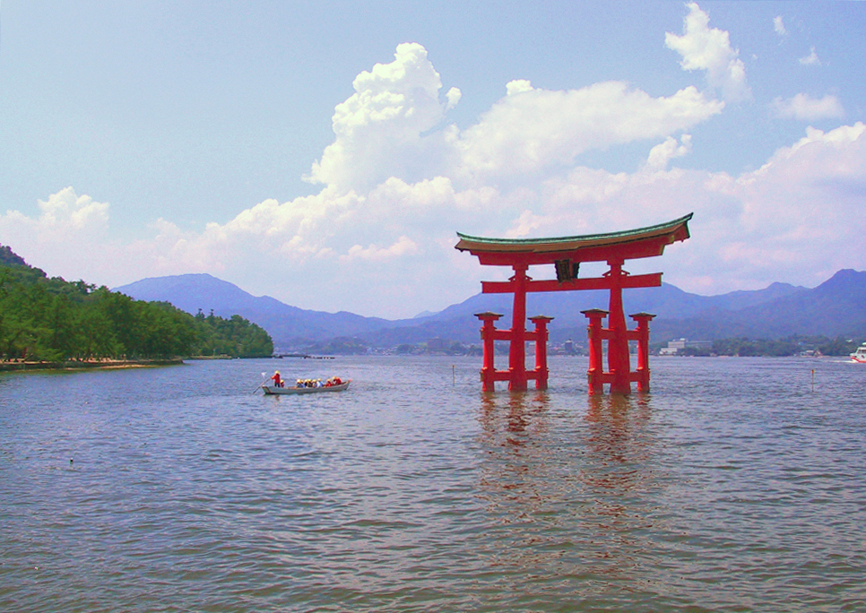
Itsukushima torii[edit]
Self-nom; a vibrantly-colored illustration for Itsukushima Shrine and Three Views of Japan. — Dan | Talk 13:04, 8 Mar 2005 (UTC)
Neutral. Good composition, but the image looks a bit pink to me. Is it possible to adjust the white balance a bit? This may change my vote to pro.-- Chris 73 Talk 14:03, Mar 8, 2005 (UTC)- I applied Auto Color and Auto Contrast in photoshop to depink. -- BRIAN0918 15:47, 8 Mar 2005 (UTC)
- The auto-color made it seem a bit too green to me, so I tweaked the colors manually (with the "color balance" tool) and uploaded it over the original: compare my original version, Brian9018's tweaked version, and my tweaked version. — Dan | Talk 17:25, 8 Mar 2005 (UTC)
- I applied Auto Color and Auto Contrast in photoshop to depink. -- BRIAN0918 15:47, 8 Mar 2005 (UTC)
- Support 2nd version or Rdsmith4's modified version. -- BRIAN0918 15:47, 8 Mar 2005 (UTC)
Oppose Image requires a couple of degrees of clockwise rotation.Support Denni☯ 00:33, 2005 Mar 9 (UTC)- To Denni and jk, I have rotated it as Photoshop suggested to make the horizon perfectly horizontal. As for the color, I lowered the saturation very slightly; I tried going further, but the colors went quite dull. I can hardly see the difference on my LCD screen, but you might if you have a better monitor. Hope this addresses your concerns. — Dan | Talk 01:11, 9 Mar 2005 (UTC)
- Support Nice photo: very illustrative. jk 19:07, 10 Mar 2005 (UTC)
- I like it. It's pretty! Support. --Sonjaaa 23:28, Mar 9, 2005 (UTC)
- Oppose. Oversaturated colour. Mark1 03:43, 10 Mar 2005 (UTC)
- The saturation has not changed from the original image, which is quite well within bounds for color saturation. The most notable change to my (IMHBEO) opinion is to the color balance, which has eliminated the unnatural green cast. I might suggest a bold crop to help feature the shrine, though. Denni☯ 23:55, 2005 Mar 10 (UTC)
- Nice setting. Support. (but if it got better i wouldn't object either) -- Dbroadwell 21:46, 10 Mar 2005 (UTC)
- Oppose. Original photo looks a little drab and all the adjusted versions look too saturated, I also don't like the canoe being in the photo. Doesn't suit the atmosphere --Fir0002 04:13, 11 Mar 2005 (UTC)
- Totally disagree about canoe - provides scale and puts it in context as a tourist destination, not a temple. jk
- A tough call. Support any of the rotated versions (all but Image:Itsukushima torii distance 2.jpg at the moment). Lower saturation in the sky is a plus for the latter two images; lower resolution is a minus. I'm also undecided whether I like it better cropped or not. —Korath (Talk) 19:54, Mar 11, 2005 (UTC)
- Support boldly cropped version (EDIT: with larger resolution), Oppose all others. The composition of the last one really adds something the others lack. Junes 14:22, 12 Mar 2005 (UTC)
- I don't know if I'm allowed to vote since I took the picture, but
I oppose the bottom two because of the lower resolution. — Dan | Talk- I recropped the image, preserving its full width, so I support Image:Itsukushima torii cropped.jpg or the original. — Dan | Talk 16:38, 12 Mar 2005 (UTC)
- I like the larger resolution, but perhaps the boat on the right-hand side should be cropped away? Junes 09:13, 14 Mar 2005 (UTC)
- I recropped the image, preserving its full width, so I support Image:Itsukushima torii cropped.jpg or the original. — Dan | Talk 16:38, 12 Mar 2005 (UTC)
- Oppose. Not particularly striking and actually rather cluttered. - Seth Ilys 20:55, 22 Mar 2005 (UTC)
- Oppose - Bevo 22:04, 23 Mar 2005 (UTC)
- Support any, killkillkill --SPUI (talk) 08:41, 26 Mar 2005 (UTC)
Root Canal Illustration[edit]


This is a simplified explanation of Pulpectomy that makes the article come to life beyond simple Xrays of teeth.
- Nominate and support. First vote here - jk 23:30, 4 Mar 2005 (UTC)
- Support, even if it makes my teeth hurt. It would be nice if a higher-resolution version (or, ideally, SVG) were available (but SVG cannot currently be uploaded, let alone viewed). A few odd white flecks in the brown blob at the bottom could perhaps be removed (or explained?). (Increased Res, fixed flecks, Thx!--jk) --Andrew 02:18, Mar 5, 2005 (UTC)
- Support. Good graphics. Also: Could a dentist check if they are correct? I know these only from the receiving end (ouch!) -- Chris 73 Talk 10:59, Mar 6, 2005 (UTC)
- Support. -- BRIAN0918 05:20, 7 Mar 2005 (UTC)
Support. Informative and crisp image. Mgm|(talk) 08:29, Mar 7, 2005 (UTC)- Based on Metju12's vote below, I'm afraid I'll have to change to oppose until facts have been checked and changed. Mgm|(talk) 19:32, Mar 17, 2005 (UTC)
Oppose. I'm sorry, but it isn't correct. I now, I'm dentist. The cavity must be wide open, drill seems funny, endo-instrument is file not needle, rubber filling must be till end of canal. --Metju12 08:14, 16 Mar 2005 (UTC)
- My dear doctor! I have made changes based on your suggestions and our conversation in Talk pages. I think I've addressed everything. Do you support this image? jk 01:08, 19 Mar 2005 (UTC)
- Support #1. Great! It's perfect, brief, well-arranged. It's not exact but enough popular. JK, you're skillful --Metju12 06:36, 22 Mar 2005 (UTC)
- Oppose #2. Just for now. I gonna talk to jk. --Metju12 23:11, 22 Mar 2005 (UTC)
- Support. There was an earlier nomination that prompted me to look at some of jk's images, and this is the one I would have nominated (except that I am a little too squeamish on medical images). I wouldn't have spotted User:Metju12's expert objections, but assuming they have been addressed satisfactorily I would have to support as the standard of illustration is very good. Oh hang on, there is a rather nice new mouse illustratio now as well. -- Solipsist 01:41, 19 Mar 2005 (UTC)
- Support #2. Oppose #1. (with respect to #1) I don't see how those drawings of teeth illustrate the same anatomy as the X-rays in the article Root canal; the drawings seem to over-simplify the structure - Bevo 17:50, 21 Mar 2005 (UTC)
- Good point. See the revised molar version on the entry for root canal. jk 21:58, 22 Mar 2005 (UTC)
- Support. Nice use of illustration. I don't see the inherent problem between this and the X-ray photo, and if the dentist doesn't object to its accuracy then I'm not sure what the problem is. --Fastfission 14:01, 22 Mar 2005 (UTC)
- Well, (with respect to #1) the X-rays show two "legs" of root for each tooth. The drawings show only one per tooth. In a typical Root Canal, are both "legs" involved, or only one? If the drawings at least showed the same view as the X-ray in the article, I'd have a much better understanding (without having to ask). Compare to the image at http://www.endodovgan.com/images/Retx_file.jpg - Bevo 15:25, 22 Mar 2005 (UTC)
- The original image is no longer featured in the Root canal article, but an improved version by the same Wikipedian is (see #2 above) - Bevo 22:28, 22 Mar 2005 (UTC)
- Well, (with respect to #1) the X-rays show two "legs" of root for each tooth. The drawings show only one per tooth. In a typical Root Canal, are both "legs" involved, or only one? If the drawings at least showed the same view as the X-ray in the article, I'd have a much better understanding (without having to ask). Compare to the image at http://www.endodovgan.com/images/Retx_file.jpg - Bevo 15:25, 22 Mar 2005 (UTC)
Promoted original. +7/-1. ed g2s • talk 14:06, 27 Mar 2005 (UTC)- Moved this nomination back to the nominations page. The original illustration is not used on any Wikipedia article, and is therefore not eligible as a Featured picture. Illustration #2 is the one used in Root canal. - Bevo 16:36, 28 Mar 2005 (UTC)
- Just to clarify, I was about to promote #1 on the 22nd March when jk uploaded the double root version #2, to address Bevo's objections. As far as I can see the new version is better in every way, although user User:Metju12 has switched back to objecting, presumably on some issues of detail which are easily corrected. Lets give it another couple of days, but sssuming that jk has addressed Metju12's & Bevo's objections with the new version and there are no new objections from previous voters, then we should promote version #2. -- Solipsist 21:58, 28 Mar 2005 (UTC)
- The original the second version had equal votes, but after I promoted I noticed the second one was being used, so I changed it to the second version.
- Just to clarify, I was about to promote #1 on the 22nd March when jk uploaded the double root version #2, to address Bevo's objections. As far as I can see the new version is better in every way, although user User:Metju12 has switched back to objecting, presumably on some issues of detail which are easily corrected. Lets give it another couple of days, but sssuming that jk has addressed Metju12's & Bevo's objections with the new version and there are no new objections from previous voters, then we should promote version #2. -- Solipsist 21:58, 28 Mar 2005 (UTC)
- Moved this nomination back to the nominations page. The original illustration is not used on any Wikipedia article, and is therefore not eligible as a Featured picture. Illustration #2 is the one used in Root canal. - Bevo 16:36, 28 Mar 2005 (UTC)
- Promoted #2. +7/-1. ed g2s • talk 14:43, 29 Mar 2005 (UTC)
Stormy skies[edit]


Two quite different sky shots, which believe it or not were taken in roughly the same spot with maybe 2-3 hours between them
- Support. Self Nom --Fir0002 23:22, 12 Mar 2005 (UTC)
- Support the first one. -- BRIAN0918 23:52, 12 Mar 2005 (UTC)
- Support picture No. 1. Those are some nice clouds. TomStar81 00:40, 13 Mar 2005 (UTC)
- Support the first. I'm not sure what type of clouds those are – I'd probably go with altostratus or nimbostratus, but I'm no meteorology expert. --Spangineer ∞ 21:07, Mar 13, 2005 (UTC)
- Oppose. These are both quite nice, but we already have several better cloud/sky photographs - in particular Image:Rolling-thunder-cloud.jpg. I'm surprised there isn't a night sky picture on the sky article. -- Solipsist 08:47, 16 Mar 2005 (UTC)
- Oppose. Not that stunning. ed g2s • talk 14:32, 27 Mar 2005 (UTC)
WMAP CMB[edit]

This image adds significantly to anything it touches. For the first time, the cosmic microwave background (CMB) temperature fluctuations were captured in detail, using WMAP in 2003. This image answered several questions, such as the age of the universe (13.7 billion years with only a 1% margin of error), or when stars first appeared (only 200 million years after the Big Bang). It is the best evidence yet for Big Bang and Inflation models, and sheds light on the nature of dark energy. This image and future, more detailed versions may even provide the first experimental tests of string theory. [6]. See the mission site for more info. - BRIAN0918 17:26, 12 Mar 2005 (UTC)
- Nominate and support. - BRIAN0918 17:26, 12 Mar 2005 (UTC)
- Hmmm I guess I'm slightly biased :)... but I say support.--Deglr6328 17:50, 12 Mar 2005 (UTC)
- Oppose An FP, while it must significantly add to an article, must also be capable of standing alone as an interesting, stimulating, exciting image. This does not. This image is pretty much nothing without its accompanying article. Denni☯ 19:24, 2005 Mar 12 (UTC)
- Support – adds significantly to its article, and is quite fascinating, thus in my opinion it satisfies FP requirements. --Spangineer ∞ 21:19, Mar 13, 2005 (UTC)
- Oppose I look at it and can't see anything but a bunch of weird color inside what looks like the earth. --Fir0002 02:27, 20 Mar 2005 (UTC)
- Support Major picture in history of astrophysics. Circeus 22:01, Mar 21, 2005 (UTC)
- Not promoted. +4/-2. ed g2s • talk 14:33, 27 Mar 2005 (UTC)
Two Plums[edit]

Some nice plums after some light rain
- Self Nom. --Fir0002 11:00, 12 Mar 2005 (UTC)
- Support Yummy! Rather similar to the apricots shot though, but I don't suppose that's grounds for objection. Junes 11:13, 12 Mar 2005 (UTC)
- Support. How come the fruits I grow never look this good? —Korath (Talk) 16:54, Mar 12, 2005 (UTC)
- Support Really quite nice. I'd like bigger, but...it's ok as is.--Deglr6328 18:26, 12 Mar 2005 (UTC)
- Oppose. The plums are very nice -- but the background is overexposed with a fair bit of chromatic aberration too. Jpatokal 06:27, 13 Mar 2005 (UTC)
- Support Works for me. Denni☯ 17:35, 2005 Mar 13 (UTC)
- Support Excellent pic - Adrian Pingstone 10:32, 14 Mar 2005 (UTC)
- Support --Thomas G Graf 15:23, 15 Mar 2005 (UTC)
- Oppose could be more visually interesting. Try some different camera angles, move some of those leaves around --jacobolus (t) 23:37, 21 Mar 2005 (UTC)
- Neutral. They look like apples to me; the picture doesn't highlight their essential plumbness. But very nice pic. -- Seth Ilys 20:41, 22 Mar 2005 (UTC)
Huntsman Spider[edit]


This impressive specimen was on my verandah one night attending to the flies which had gathered around a porchlight, and I took the opportunity to take a snap. I tried waiting for an opportunity to get the spider with a fly, but as soon as he/she got one, the spider would run off into a corner to eat it in peace.
- Support. Self Nom. --Fir0002 10:34, 12 Mar 2005 (UTC)
- Support. Very nice shot. -- Chris 73 Talk 11:17, Mar 12, 2005 (UTC)
- Support. That thing is creepy. How big is it, actually? Junes 11:35, 12 Mar 2005 (UTC)
- Support -- Nothing in the world would get me this close to a huntsman spider, except this photo. - Longhair | Talk 15:23, 12 Mar 2005 (UTC)
- I was really hoping he wouldn't jump up at the annoying thing flashing at his/her face!!! --Fir0002 23:16, 12 Mar 2005 (UTC)
- Ugh... I hate spiders.... Opp...... Oppo......... fine, Support. (Can you please put some sort of copyright tag on the image?) -- BRIAN0918 16:09, 12 Mar 2005 (UTC)
- Support. (Besides the copyright tag, could I trouble you to upload it at Image:Huntsman spider.jpg or something similar? "Huntsmen spider" makes me twitch.) —Korath (Talk) 16:49, Mar 12, 2005 (UTC)
- Done. --Fir0002 23:16, 12 Mar 2005 (UTC)
- Ughh. Horrible. Support!--Deglr6328 18:08, 12 Mar 2005 (UTC)
Oppose. While a fascinating and clear image, provides no idea of how big the thing is. Not that I want to know. :P →mathx314(talk)(email) 20:31, 12 Mar 2005 (UTC)- I hope you like the scaled version, its probably not 100% accurate, but it is very close. Leaned to slightly underestimate the size of the spider, rather than over estimating. --Fir0002 23:16, 12 Mar 2005 (UTC)
- Support the version without the scale - the slant is great and the image is striking. The size of the spider belongs in the article, not necessarily the picture. --Spangineer ∞ 21:23, Mar 13, 2005 (UTC)
- Support both pics - Adrian Pingstone
- Support unscaled pic. Mgm|(talk) 11:20, Mar 14, 2005 (UTC)
Vitrification[edit]


A striking image of an experiment at the Pacific Northwest National Laboratory in which radioactive waste materials are heated and "glassified" into obsidian-like insoluble ingots for eternal disposal. High detail and conrast with the depth of field just shallow enough to fix the viewers attention on the perfectly focused subject. Also nicely shows the viscous undefined phase transition of amorphous materials, I think. --Deglr6328 02:46, 12 Mar 2005 (UTC)
- Nominate and Support.--Deglr6328 02:46, 12 Mar 2005 (UTC)
- I liked this image, and so couldn't resist cleaning it up. I took the source TIFF and ran it through photoshop (maybe I went overboard?). So, now I submit a 2nd, cleaned-up version. And, sure why not, a 3rd version that's been "auto-levelled", which adjusts the contrast, shadow, and highlight. Support any of them. -- BRIAN0918 05:39, 12 Mar 2005 (UTC)
- I like the 3rd version better now. I contemplated doing that crop myself before submitting. Though I don't like that it's smaller than the original I'm sure this is an unavoidable consequence of the edits. Also, the contrast adjustment appears to have made the glass lighter in color, giving it an apparently higher blackbody temperature. Definitely NOT a big deal though. Very good work! Thank you! :o)--Deglr6328 17:35, 12 Mar 2005 (UTC)
- Support-
I like them both, so either one will do. Nice shot.I like the third one best. TomStar81 05:42, 12 Mar 2005 (UTC) - Support, any of them, slight preference for third one. -- Chris 73 Talk 11:20, Mar 12, 2005 (UTC)
Support Actually, I like the first one best Junes 11:32, 12 Mar 2005 (UTC)- Support beautiful picture.
FirstSecond one is best. Smoddy (t) (e) (g) 14:40, 12 Mar 2005 (UTC) Oppose for now. First and second images are miscropped, and the colors in the third are inferior to my eye. (Png is inappropriate as well, for the latter two - a jpg would be a third the filesize, with no visible loss of quality.) —Korath (Talk) 16:39, Mar 12, 2005 (UTC)- Support version #3. Fredrik | talk 18:08, 12 Mar 2005 (UTC)
- Support second version. ed g2s • talk
- Support second version. The colours are about right in this one.
It might work slightly better if the black edge on the left were extended a little so that the top of the drum is centred, but it probably wouldn't make much difference.Hmm, perhaps not. The first version is centred on the drum and the composition looks a little unbalanced to the right. -- Solipsist 07:54, 18 Mar 2005 (UTC) - Support fourth version. In photoshop, i lightened the picture a ton, and there are fingerprints and scratches and dust all over it. I believe it is a scanned in photograph, and it appears that the background was intended to be black. So I took the whole background area and made it pure black, instead of slightly off, which 1) removes the scratches Brian0918 was worried about, and 2) improves the visual appeal of the image. I also took the liberty to remove many dust motes and scratches from the main part of the image. I left the color almost wholly untweaked, however, only slightly boosting the white (there were no 255 value pixels in any channel before). I also cropped this image a bit, but not as much as the 2nd and 3rd versions. Someone else should feel free to crop more or less. Now it's easy, as the background is just black. Oh, and I removed a small distracting blue thing from the right side, halfway down. --jacobolus (t) 05:03, 19 Mar 2005 (UTC)
- Wow, I never realized how bad it was until I touched that little "gamma" setting. :o) Thanks much for the work, this is obviously now the superior image in every respect.--Deglr6328 05:46, 19 Mar 2005 (UTC)
- Support. Simply gorgeous. - Seth Ilys 20:48, 22 Mar 2005 (UTC)
Spotted Flower Chafer[edit]

A spotted flower chafer
- Support Self Nom. --Fir0002 08:59, 14 Mar 2005 (UTC)
- Support Outstanding pic. Good focus, and the beetle stands out from the background nicely - Adrian Pingstone 10:27, 14 Mar 2005 (UTC)
- Support, excellent pic. Mgm|(talk) 11:17, Mar 14, 2005 (UTC)
- Oppose Image could be larger and I'd really like to be able to see the full pattern on its elytra. We do need a beetle pic featured, but I don't think this is it. --Deglr6328 02:22, 15 Mar 2005 (UTC)
- Oppose. I think we need a higher resolution image here. The jpeg compression leaves unacceptable artefacts. Enochlau 07:59, 17 Mar 2005 (UTC)
University of Guanajuato[edit]

This image, of the University of Guanajuato in Guanajuato, Mexico, I believe nicely shows the beautiful architecture of the main building and its dome. --Spangineer ∞ 03:31, Mar 16, 2005 (UTC)
- Self-nominate and support. --Spangineer ∞ 03:31, Mar 16, 2005 (UTC)
- Oppose. Only a small bright detail, lots of dark area, no good overview of the building -- Chris 73 Talk 03:41, Mar 16, 2005 (UTC)
- Agree with above. Oppose. Can't really get an understanding of the architectural aspects of the bldg. Enochlau 07:57, 17 Mar 2005 (UTC)
- Oppose, too dark, can't see any detail. Mgm|(talk) 11:08, Mar 17, 2005 (UTC)
- Oppose The dark red foreground spoils it and not enough seen of the dome - Adrian Pingstone 14:42, 17 Mar 2005 (UTC)
- Oppose -Awkward, poor lighting, chopped dome, etc. --Deglr6328 01:06, 18 Mar 2005 (UTC)
- Oppose. Grainy, and too much contrast between the dome and the foreground (though less so on the hi-res). I like the composition, however, and would likely support a daylit photo from the same angle. —Korath (Talk) 23:21, Mar 18, 2005 (UTC)
- Oppose -- Too dark. - Longhair | Talk 12:08, 21 Mar 2005 (UTC)
- Not promoted -1/+1
Brightly Colored Tarantula[edit]


This photo was actually of a museum display, so I can't credit bravery for this spider :) Unfortunately due to the lighting (and the tarantula being behind reflective glass) This was the best angle I could get
- Support. Self Nom. --Fir0002 08:37, 14 Mar 2005 (UTC)
- Support Junes 09:06, 14 Mar 2005 (UTC)
- Support. Did the display say what species it was? My guess is it's a Mexican Red-kneed Tarantula, but I'm no expert. -- BRIAN0918 13:49, 14 Mar 2005 (UTC)
- Yeah i though it was something like that as well. I think the display did have a name, but I didn't have the foresight to write down a name unfortunately --Fir0002 21:15, 15 Mar 2005 (UTC)
Oppose All eight legs out of focus. Too bad -I like the colors and the composition. Support sharpened image. Denni☯ 22:04, 2005 Mar 14 (UTC)- Have tried a bit of sharpening, but I didn't really think that the legs were much of an issue, and am not sure if this edit is much better --Fir0002 08:41, 15 Mar 2005 (UTC)
- Support I like this one. Its a good bold image of a spider which many people will recognise. The quality imperfections are small enough not to worry me, although it would be good if the specific species could be identified. -- Solipsist 08:53, 16 Mar 2005 (UTC)
- Support but I'd suggest loosening the crop a little. Top is more comfortable. jk 06:44, 19 Mar 2005 (UTC)
- Oppose. Cut-out looks too unnatural. ed g2s • talk 14:44, 29 Mar 2005 (UTC)
Long Beach, CA at night[edit]

It looks pretty and stunning. Used in Long Beach, California. Public domain image. -- AllyUnion (talk) 06:01, 14 Mar 2005 (UTC)
- Nominate and support. -- AllyUnion (talk) 06:01, 14 Mar 2005 (UTC)
- Support. I like how it sits at the edge of a cityscape surrounded by the glow of lights in the sky, not to mention the smoke of industry on the side. -- Riffsyphon1024 06:06, Mar 14, 2005 (UTC)
- Support I think its striking. TomStar81 03:06, 15 Mar 2005 (UTC)
- It's a dramatic pic all right, but I oppose because it looks like after the apocalypse. What an evil orange that is! I find it a genuinely uncomfortable picture, which I'm sure is not the intent. Denni☯ 00:00, 2005 Mar 16 (UTC)
- I don't see any mushroom clouds. -- Riffsyphon1024 18:55, Mar 17, 2005 (UTC)
- It reminds me of the advertisements for the Need For Speed games that EA runs every now and again. TomStar81 09:15, 19 Mar 2005 (UTC)
- I don't see any mushroom clouds. -- Riffsyphon1024 18:55, Mar 17, 2005 (UTC)
- Support, looks great to me. --Spangineer ∞ 03:53, Mar 16, 2005 (UTC)
- Support. Wow, makes me want to go on holidays to the US. Enochlau 08:00, 17 Mar 2005 (UTC)
- Support. The orange sky works wonderfully with the opposing blue water, lights, and buildings. -- user:zanimum
Promoted +6/-1